Building a design system and website from the ground up
Establishing a brand identity and design system from scratch, then redesigning 20 pages and templates around it.
Overview
H.R. MacMillan Space Centre had no defined visual identity, and its website hadn't kept pace, with the institution's long-term vision living in conversations rather than in documented design direction.
I mentored a team of students through a full design sprint from discovery to delivery. I also worked with the Directors to establish branding guidelines and creative strategy.
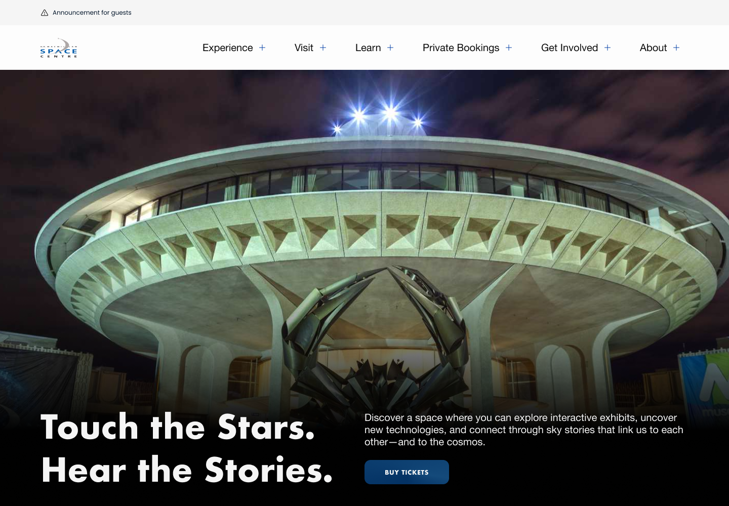
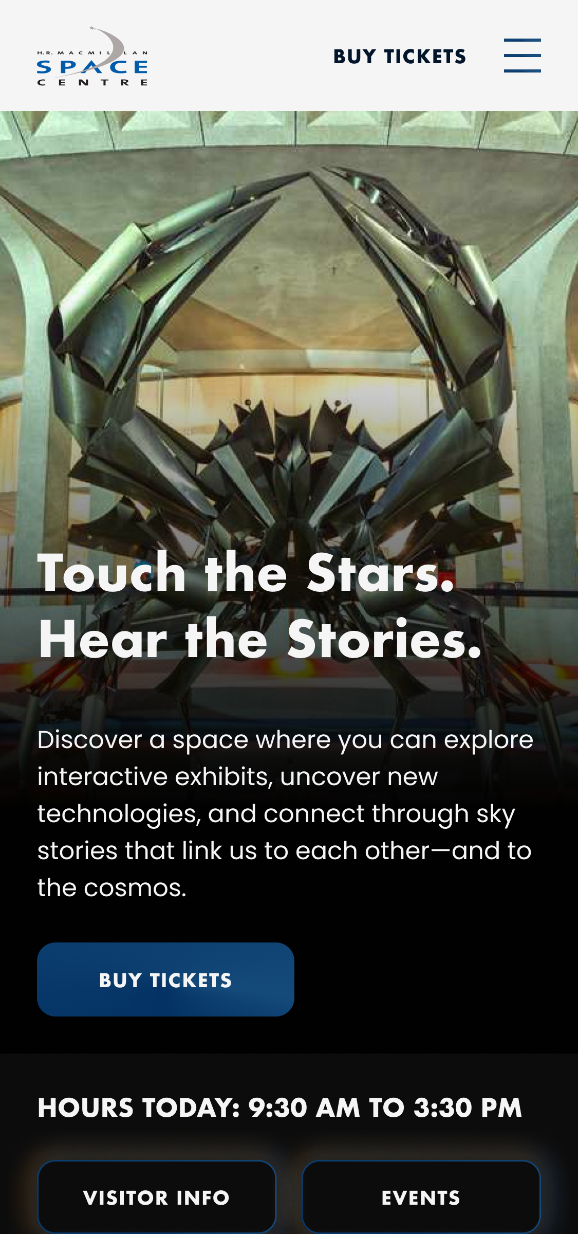
A complete brand identity and design system now live in production at spacecentre.ca across 20 pages, carrying consistently into social and campaign materials beyond the site itself.
The problem
No brand to design within
H.R. MacMillan Space Centre, Vancouver's planetarium and space science museum, had an established social media presence but no defined visual identity. The website also looked dated and did not align with the company's vision. I was brought on as a contract lead designer to mentor students through the website build. Additionally, I created a full design system and branding guidelines from the ground up.
The Space Centre had some loose visual conventions for social media, but nothing formalized beyond that and no website branding. I mentored four students during the project using agile methods and teaching best design practices.
Design goals
A brand strong enough to stand on its own. Success meant any future page, post, or campaign could be built confidently within the system
With 20 pages and recurring templates like the blog, the site needed to hold up long after the engagement ended, usable by whoever maintained the site after I left.
The discovery
Running it as a full design sprint
I structured the project like a full design sprint rather than jumping straight to visuals. Alongside the research, I met directly with the Space Centre's brand director to understand their long-term vision for the institution. This context was essential to shaping a brand identity meant to hold up well beyond this one redesign.
The brand
A brand identity built on their long-term vision
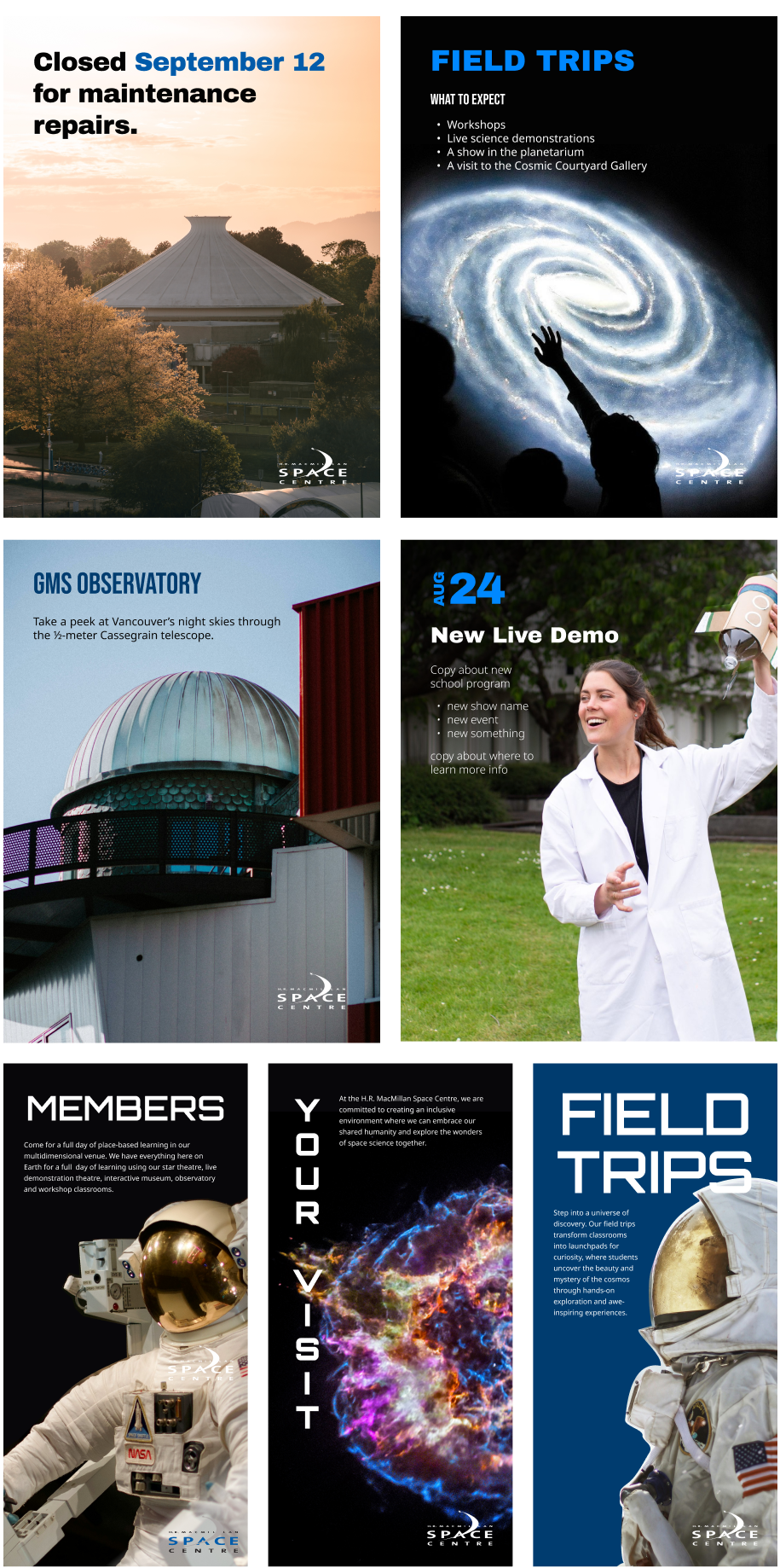
Rather than designing a brand in isolation, I anchored the identity in conversations with the brand director about where the Space Centre saw itself heading. From there, I built out moodboards to explore direction, aligned with stakeholders on one, and developed it into the full visual identity: colour, type, and imagery.
Tone
Approachable, confident, and inspiring. Inviting everyone to explore the beauty and mystery of the cosmos with curiosity and wonder.
Functional
Practical, clear, instructional. It organizes the content in an easy to understand way for the users. Primarily used for wayfinding and calls to action.
Expressive
Where brand personality shines. Used to convey brand values, spark curiosity and build connection: headlines, social media, marketing and more.
Typography
Discovery without limits
Archivo Black
The impactful typeface, used for headers.
CELEBRATE EARTH DAY
Bebas Neue
The condensed style, for headings and eyebrows. Always in all caps.
Plan your visit
Open Sans
The most versatile typeface, used for body copy.
360° immersive dome
Orbitron
The expressive typeface, used for accents.
Colour
Primary, for anything about the Space Centre
When Brand Blue doesn’t stand out enough
Secondary, when the other blues are too dark
Secondary, for a muted tone
The website
From wireframes to 20 pages, in phases
The project moved through three phases, each handing off cleanly into the next.
-
Wireframes
Student designers on my core team produced early low-fidelity wireframes covering the full 20-page sitemap, which I reviewed and directed before we moved to visual design.
-
High fidelity, together
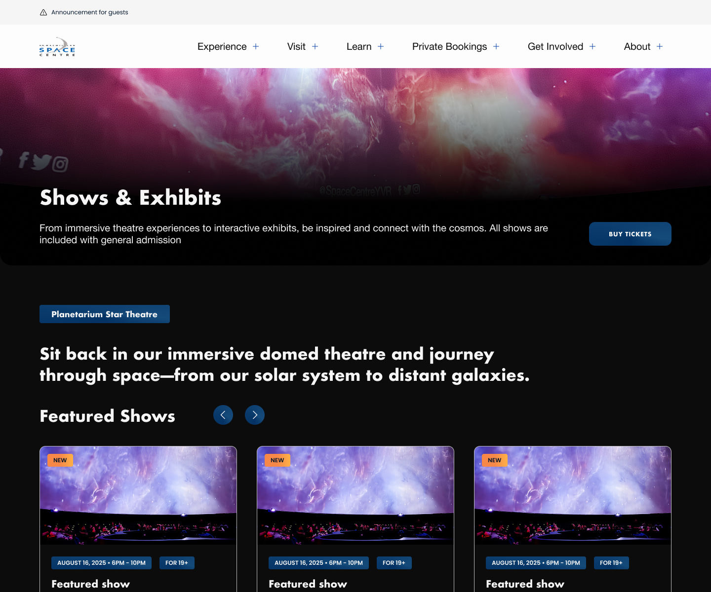
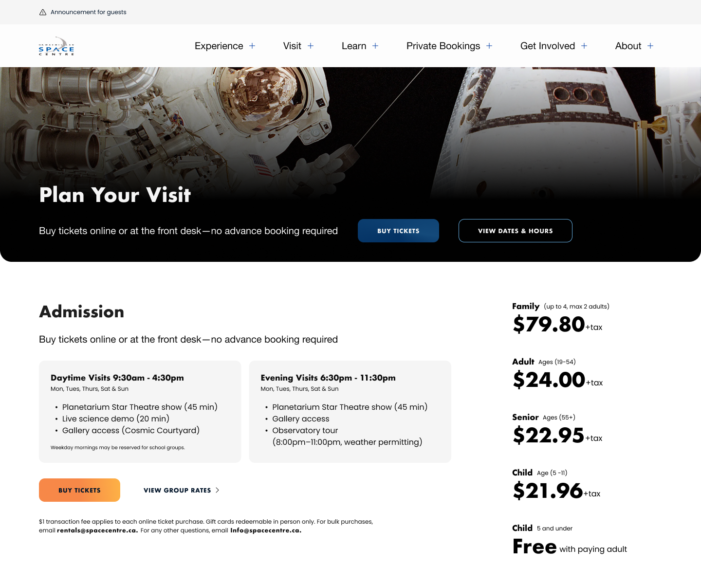
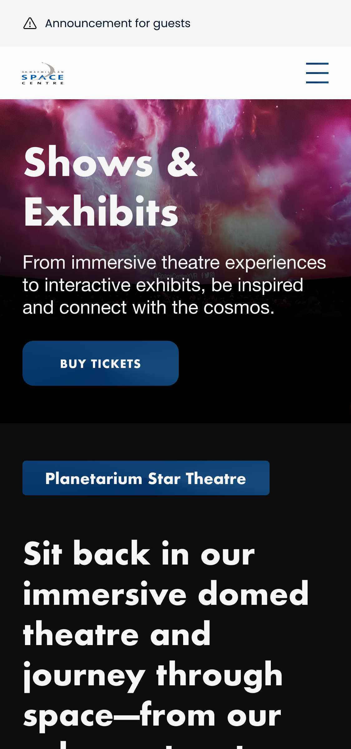
I worked directly alongside two students to turn those wireframes into high-fidelity designs across every page and template, aligning with stakeholders as the designs took shape.
-
QA and brand identity
As the build came together, I QA'd the live site against the designs while leading development of the full visual brand identity — the piece that would tie every page and future post together.
Leading the team
Mentorship at two levels
Mentorship ran at two levels across the four students involved in the broader program.
Two students worked with me through the full project, from discovery through delivery. They handed off the initial wireframes, then designed every page alongside me.
I also mentored two additional students outside my core team, giving them regular feedback on their UX and visual design work throughout the engagement.
Impact and takeaways
With a design system in place, the Space Centre can add new pages, posts, and campaigns without re-deciding what the brand looks like each time. The identity now carries consistently from the website through to social, which gives the institution more credibility with every visitor who lands on the site. The redesign is live at spacecentre.ca today.
Leading is a different skill than designing
Working with the students meant understanding their strengths and goals for the project. I focused on highlighting their skills but also teaching design best practices. There was a learning curve for me to determine their baseline and provide good feedback. By the end of the project, I had a much better rhythm with the students.